 Lance Avery Morgan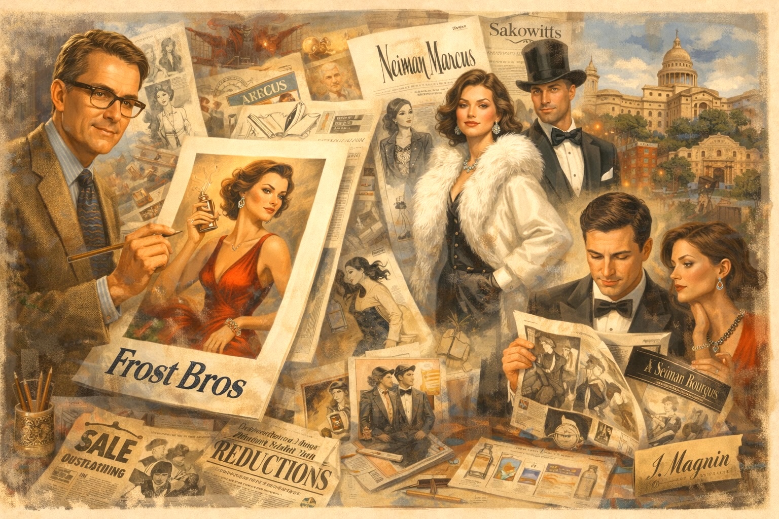
From Frost Bros. To Neiman Marcus, A Generation Of Illustrators Transformed Newspapers Into Portals Of Elegance And Imagination. Discover The Richly Illustrated World Of Texas Retail Advertising, Where Craftsmanship And Creativity Shaped Consumer Dreams
Images created by Curated Texan and courtesy of the University of Texas–San Antonio
Before the endless scroll, before targeted ads and algorithmic persuasion, there was a moment each morning when the world quite literally opened in your hands. The daily newspaper, broad, weighty, and sprawling, was more than a source of headlines; it was a canvas. And within its expansive folds lived a kind of visual seduction that today feels almost mythic: full-page fashion illustrations that didn’t just sell clothing, but an entire way of life. In Texas, department stores elevated this art form to dazzling heights, transforming ink and paper into portals of aspiration, elegance, and imagination, as our vintage hunter Lance Avery Morgan shares.
When Department Store Style Stopped You in Your Tracks
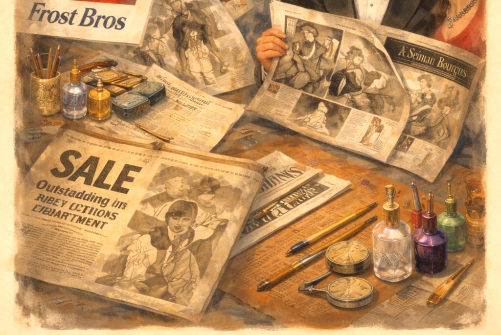
In those pre-digital days, advertising didn’t interrupt your attention… it earned it. Measuring roughly a foot and a half wide and two feet tall when unfolded, the newspaper commanded physical space and, in turn, demanded engagement. You didn’t swipe past it on a dead scroll; you paused, you lingered, you looked. There was ritual in the act: the rustle of pages, the faint scent of ink, the choreography of unfolding sections across the breakfast table.
And then, you discovered them: the ads.
They were lush, cinematic, and impossibly chic. Texas retail giants like Neiman Marcus, Sakowitz, Sanger-Harris, Scarbrough’s, and plenty more stores understood something fundamental: presentation was everything. These weren’t mere promotions; they were declarations of taste. They told you who you could become with the right coat, the right silhouette, the right moment of confidence.
Frost Bros. And The Texan Translation Of Elegance
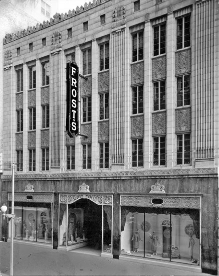
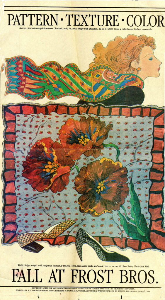
But it was in San Antonio and Austin where Frost Bros. quietly, and then boldly. set a new standard. Their advertisements didn’t simply mirror Paris or New York; they translated global fashion into a distinctly Texan visual language. There was polish, certainly, but also warmth. Grandeur, but never aloofness. Frost Bros. created a world where sophistication felt attainable, where elegance had a regional accent.
To flip through those pages was to travel, from the boulevards of Europe to the sunlit avenues of Texas, without ever leaving your chair.
The Artist Who Defined An Era
At the center of this creative force was Max Jordan, whose work would come to define an era. When the University of Texas–San Antonio acquired the Max Jordan Papers, it wasn’t simply a donation; it was a revelation. The sketches, mock-ups, proofs, and final advertisements offer a rare, behind-the-scenes glimpse into a process that was as meticulous as it was magical.
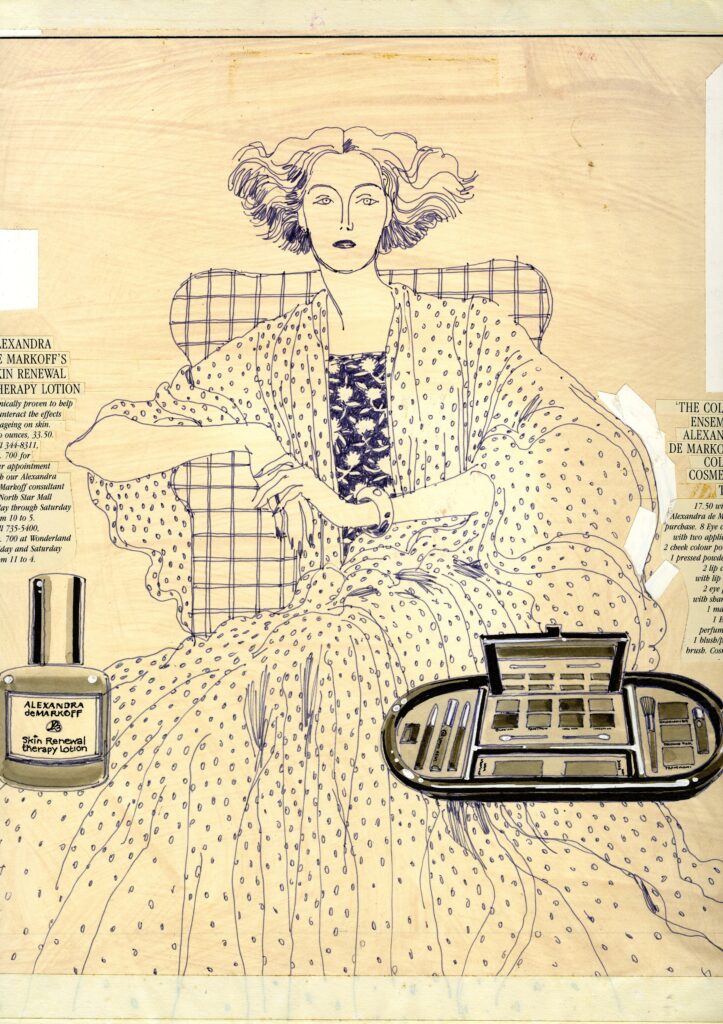
Jordan’s illustrations, many created during the 1970s and 1980s for Frost Bros., were masterclasses in aspiration. Whether depicting a sharply tailored suit, a sweeping evening gown, a sporty swimsuit, or the delicate allure of a fragrance, his work leaned into rich, saturated color and evocative storytelling. A single image might suggest an entire evening: where you were going, who you might meet, and how you would feel when you arrived.
These weren’t just products. They were invitations…into a more polished, more glamorous version of oneself.
From San Francisco To The Lone Star Stage
Jordan’s artistic reach extended well beyond Texas. His earlier work with I. Magnin in San Francisco reveals a continuity of vision: elegance rendered with precision, narrative embedded in every brushstroke. Yet it was in Texas where his work found a uniquely receptive audience; one attuned not only to fashion but also to the power of storytelling itself.
Texans didn’t just want to dress well; they wanted to live well. Jordan gave them the visual language to imagine it.
The Craft Behind The Curtain
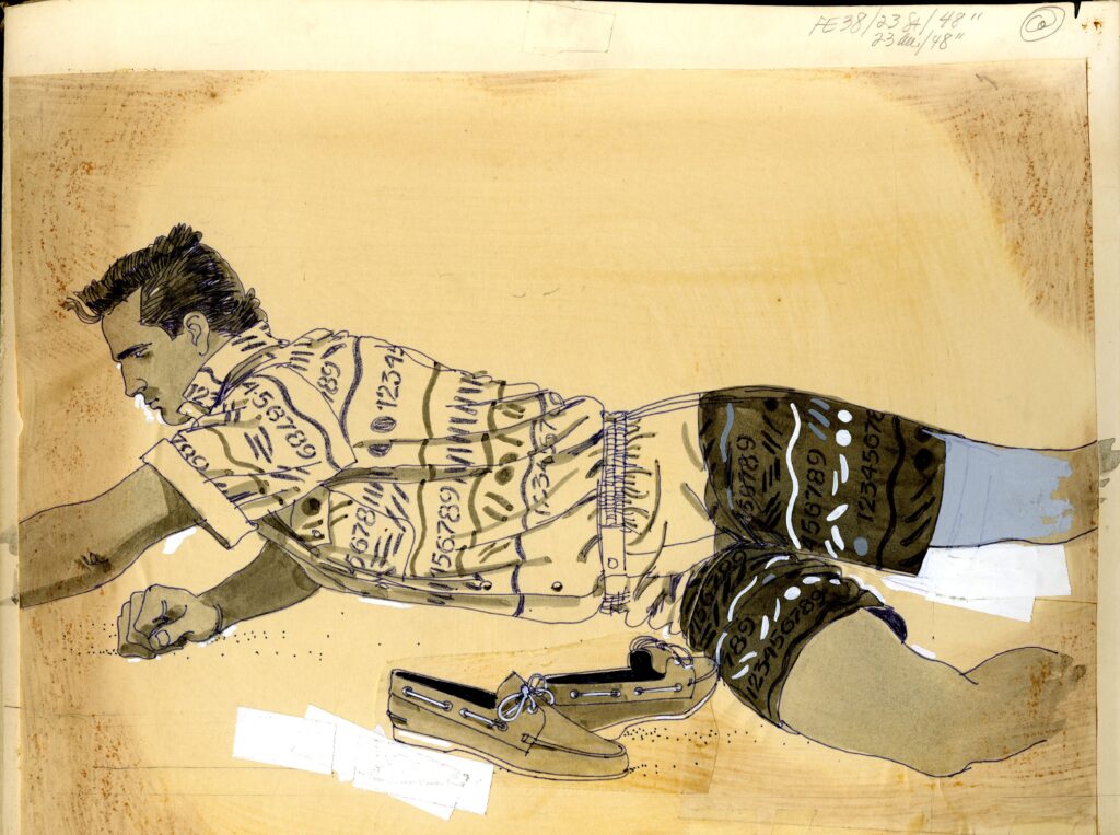
Behind every finished ad was an intricate, layered process that today feels almost artisanal. Initial concept sketches gave way to refined mock-ups, which evolved into page proofs before finally reaching print. Each stage required patience, precision, and collaboration.
Jordan worked closely with Frost Bros.’ Creative Director, Marlon Chapman, alongside a small but formidable team of designers, copywriters, and production specialists. Together, they produced a steady stream of imagery that ranged from striking black-and-white compositions to vivid, full-color spectacles.
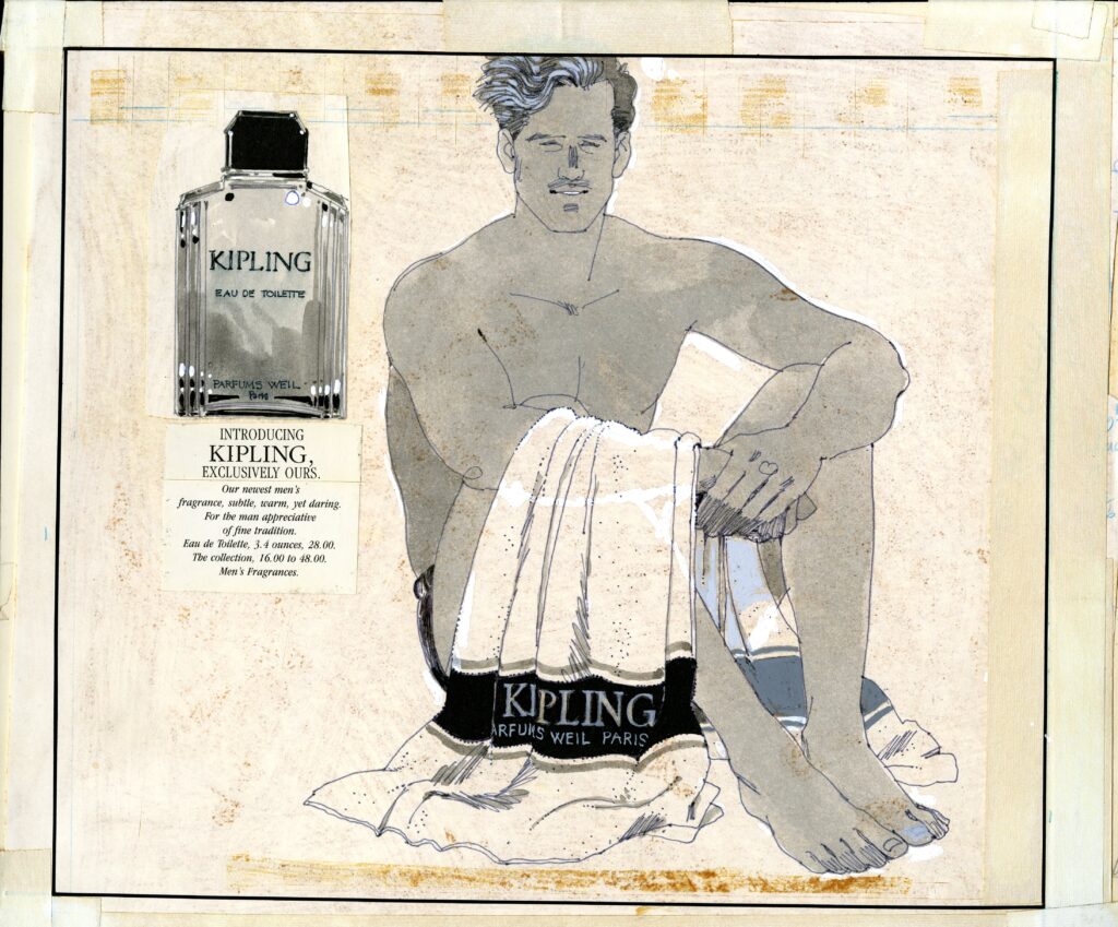
This was advertising as an atelier, where every line, every hue, every gesture was intentional. “I worked as an in-house illustrator at Frost Bros. before Max arrived,” shared native Austinite Missy Harris, who was an in-house illustrator at the store from 1965-67. “I was familiar with his artwork before he arrived from San Francisco. Even today, when you view his work, it is two-dimensional. His layouts and finished art had movement, be it in a menswear male’s hairstyle, a pleated skirt, or simply stylized “ladies.” His art was almost musical and poetic, with a certain positioning of the human form against a vast white background. That was a distinct Frost Bros. look because the store frequently purchased significant ad space, and this contrast made the advertisement stand out even more distinctively.”
When Newspapers Became Galleries
These ads didn’t just fill space; they elevated it. They transformed the daily newspaper into a temporary gallery, where high art and high fashion coexisted with world events and local news. One moment you were reading about politics or markets; the next, you were transported into a dreamscape of chiffon, cashmere, and possibility.
There was no algorithm deciding what you should see. No personalization engine predicting your desires. Instead, there was a shared cultural experience, millions of readers encountering the same imagery, the same vision of beauty, all at once.
The Enduring Allure Of The Analog
Today, as we navigate a world dominated by digital screens at warp speed, there’s something almost radical about looking back at this era. It reminds us that advertising was once slower, more deliberate, and undeniably more tactile. That beauty was crafted, not computed. That anticipation was part of the experience.
And perhaps most importantly, it underscores a truth that still resonates: the most powerful way to capture attention isn’t through volume, it’s through vision.
Why It Still Matters
In an age where content is infinite and attention is fleeting; the legacy of these illustrated advertisements offers a compelling counterpoint. They prove that restraint can be seductive. That storytelling can elevate commerce into culture. And that when artistry leads, audiences follow.
For Texas, this wasn’t just a chapter in retail history, it was a golden era of visual identity, where style met storytelling and left an indelible mark on generations who still remember the feeling of turning a page… and being transported.
8 Reasons The Golden Age Of Texas Fashion Advertising Still Matters
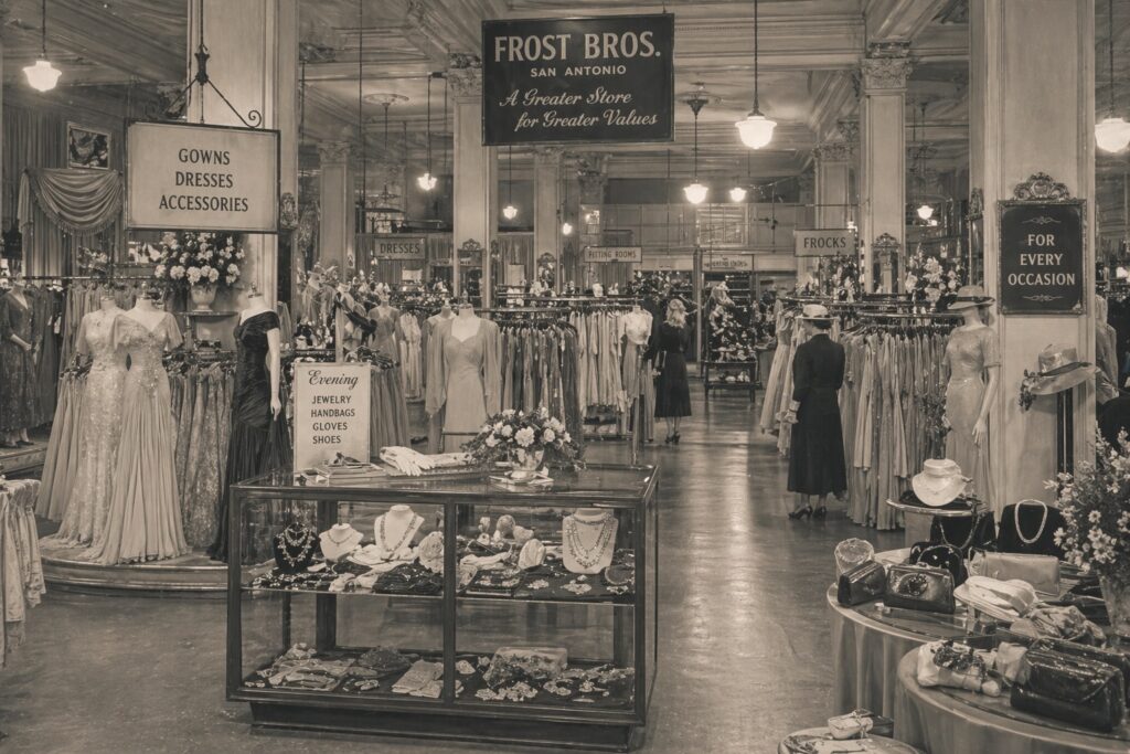
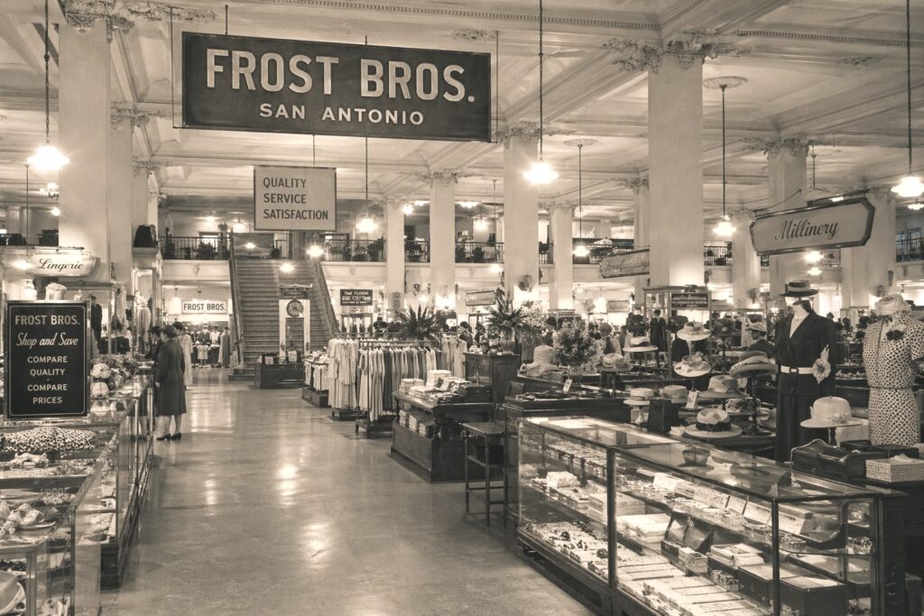
1. It Turned Newspapers Into Art Galleries
Full-page illustrations transformed everyday reading into a visual experience.
2. It Valued Craft Over Convenience
Every ad was hand-conceived, sketched, and refined… no shortcuts.
3. It Sold A Lifestyle, Not Just A Product
These images invited readers into a world of aspiration and elegance.
4. It Elevated Regional Identity
Texas retailers infused global fashion with local sophistication.
5. It Celebrated Collaboration
Illustrators, creative directors, and designers worked as true artistic teams.
6. It Rewarded Attention
Unlike today’s fleeting ads, these demanded, and deserved, a second look.
7. It Created Collectible Moments
Many ads were so beautiful, they were saved, clipped, and remembered.
8. It Laid The Foundation For Modern Branding
Today’s visual storytelling owes a quiet debt to these richly imagined pages.